Skelcon
Built from the ground up
+ Logo Design
+ Brand Identity Design
+ Art Direction
+ Graphic Design
+ Rollout & Execution
Launching a new brand in construction means earning credibility before you've even broken ground. There's no heritage to lean on, no reputation to borrow. You build it from scratch, which is exactly what we did.
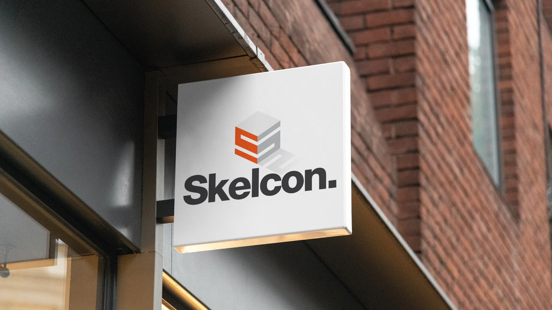
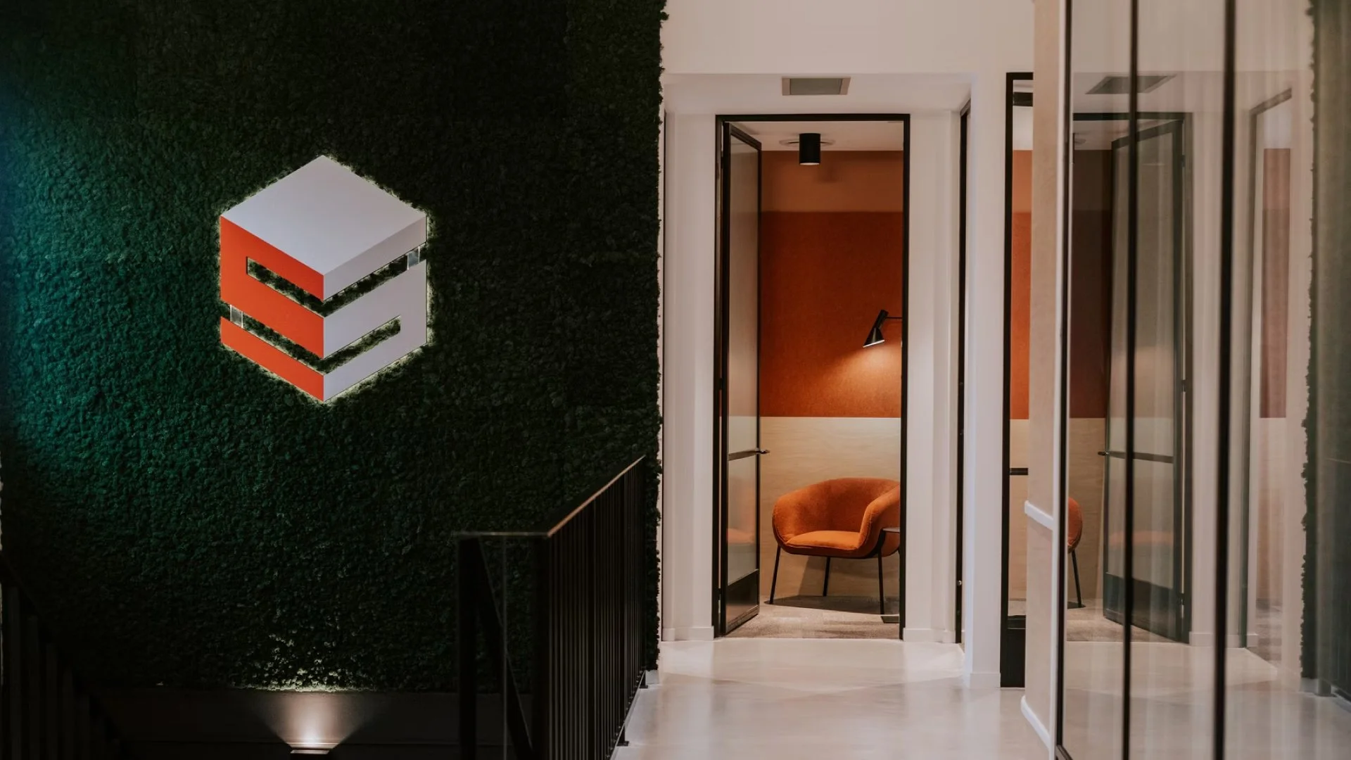
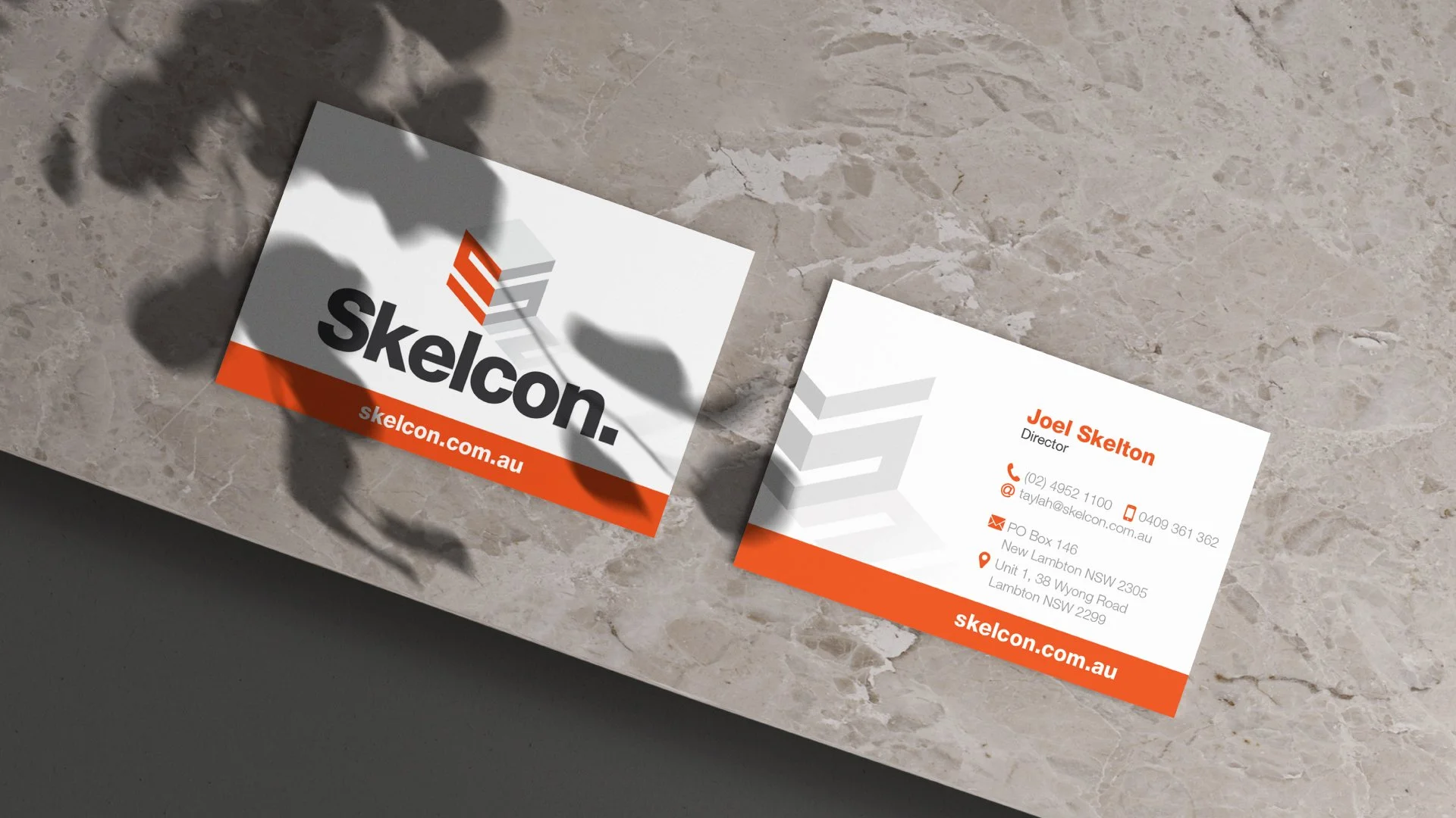
Skelcon's identity is anchored by a custom 3D 'S', a bold mark inspired by architectural form and engineered for versatility across physical and digital spaces. It's the kind of mark that works as hard as the business it represents. Strong, structured and impossible to overlook.
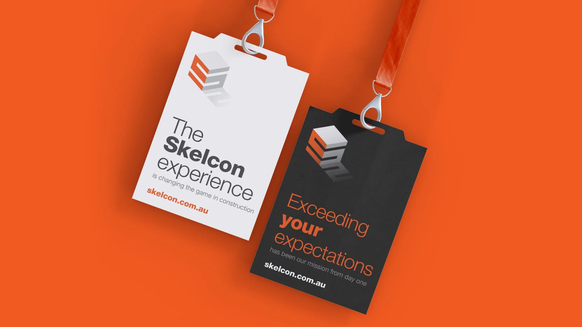
Paired with a clean, modern system, the brand lays strong foundations for growth and makes Skelcon stand tall in a competitive market. Watching a startup grow into an award-winning construction company is one of those reminders of why this work matters. Built from scratch, built to last and still going strong.